
Matcha cafe design starts at the order point, not the mood board. The counter must let staff weigh or portion tea, prepare a smooth base, add milk or water, and hand off the drink without crossing the queue. Guests need to understand the menu and find a place to wait. Color and materials can support the concept, but service flow determines whether the room works at noon. Our matcha beverage formulation guide covers a related menu decision: the drinks the space must be built to serve.
Contents
- 1. What service model is the space for?
- 2. How should the guest route work?
- 3. Where should the matcha station sit?
- 4. What storage belongs behind the bar?
- 5. How can the queue avoid the pickup area?
- 6. What should the menu explain at a glance?
- 7. How should seating support the concept?
- 8. Which materials and lighting help service?
- 9. How do you test the layout before opening?
- 10. What should be revised after launch?
1. What service model is the space for?
Let the operating brief lead the plan
Write down the likely order mix: straight matcha, hot lattes, iced lattes, bakery items, retail packs, and any tasting service. Estimate a busy fifteen-minute window from observed demand or a conservative scenario, then ask how many drinks the proposed station can produce. A small room built for lingering tea service needs a different counter from a takeaway shop that handles many iced drinks. The menu also decides whether the station needs milk steaming, cold storage, a sink, and space for cups and ice.
Map the full order from guest arrival to handoff. Include payment, preparation, pickup, and where a guest steps aside to add a lid or read a label. Do this before choosing furniture. A beautiful central table can become an obstacle if it blocks the route from queue to pickup. The operating brief gives the designer a way to judge choices beyond appearance and keeps later equipment changes from overwhelming the room.
2. How should the guest route work?
Walk the plan as a first-time visitor
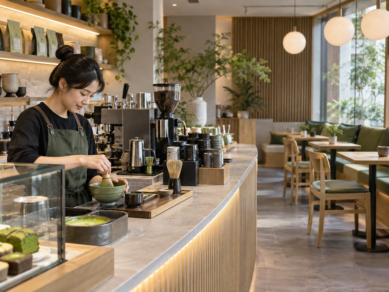
Stand at the entrance and ask what a guest sees first. The menu and order point should be apparent without a staff explanation. The line should have a sensible place to form without blocking the door, display, or seating access. Once paid, guests should know where to wait and where finished drinks will appear. Try the route with a person carrying a bag, another with a stroller, and staff moving supplies. Local accessibility and building requirements must be checked with qualified professionals for the site.
Do not rely on a diagram alone. Tape the proposed counter and furniture footprints on the floor if possible. Run a few mock orders and watch where people hesitate or cut across a working area. If a promotional display catches attention but obstructs a route, move it. If the menu is visible only after a guest reaches the till, the queue may slow while people decide. The best route is easy to understand on a first visit and calm during a rush.
| Guest stage | Design question | Evidence in a walkthrough |
|---|---|---|
| Entry | Where do I order? | Guests find the menu quickly |
| Payment | Where do I wait? | Queue and waiting do not overlap |
| Pickup | Where is my drink? | Names and cups are easy to match |
3. Where should the matcha station sit?
Keep the preparation sequence compact
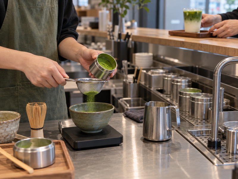
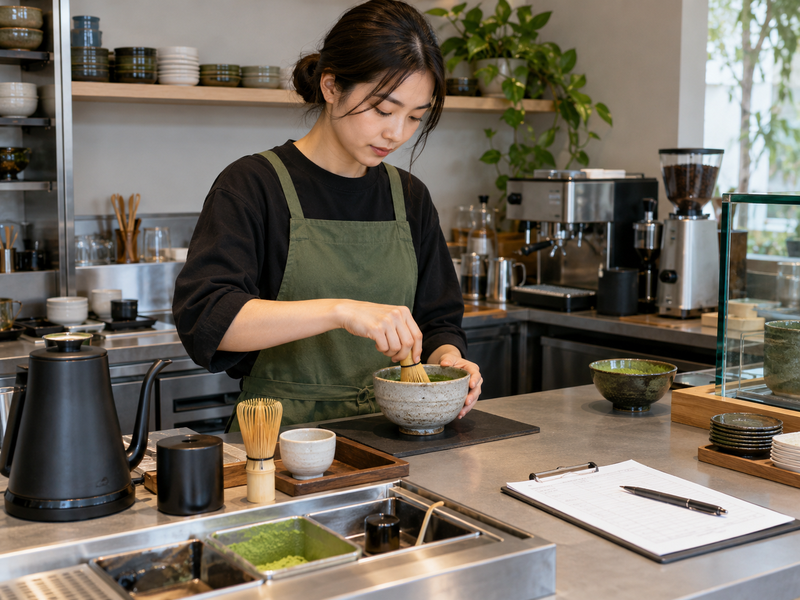
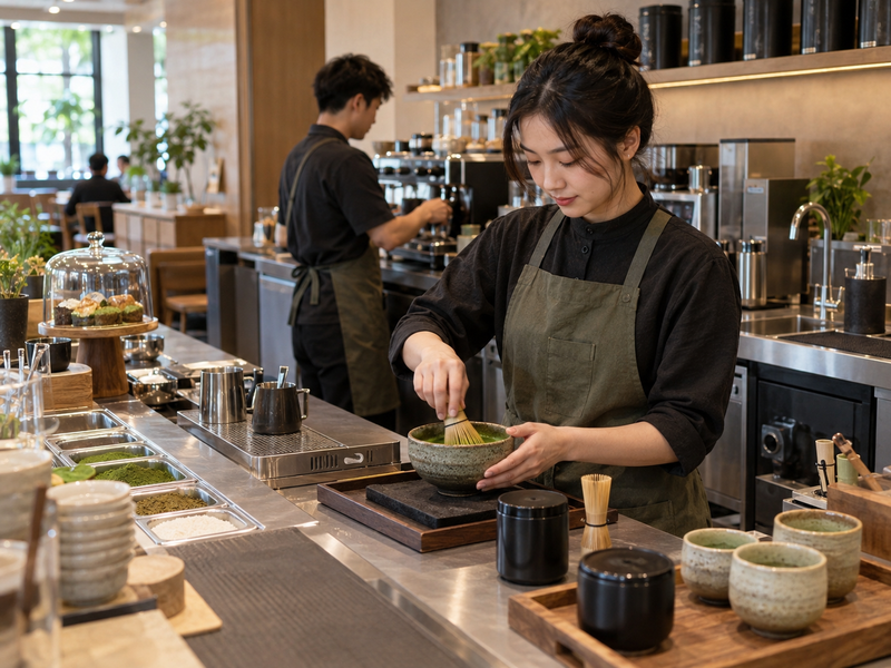
The matcha station needs the selected powder or portion, a weighing or dispensing method, water, mixing tool, waste point, and access to milk or ice for the drinks sold. Put these in the order of work. Staff should not have to reach across an espresso machine or walk behind colleagues for each cup. A station that is attractive from the guest side can still be awkward behind the counter; test it from the worker’s side with a real cup and tools.
Consider the visibility of preparation. A guest may enjoy seeing matcha whisked, but a display position should not make every step slower or expose powder to moisture and heat. Provide room for a passing base check before milk or ice is added. Cleaning access matters as much as preparation space. Confirm utilities, surfaces, and equipment placement with the appropriate site professionals and local rules. A sketch cannot certify a compliant bar, but it can reveal obvious conflicts before installation.
4. What storage belongs behind the bar?
Store by frequency and handling needs
Keep the approved matcha, cups, and daily tools close to the station, while backup stock belongs in a protected storage area. Powder should be handled according to supplier guidance, away from steam and repeated open-container exposure. Chilled milk and prepared ingredients need storage that supports the site’s food-safety procedure. The bar must have enough working stock for a rush without becoming a cluttered shelf of half-open packs.
Create a simple replenishment map: what is in reach, what is nearby, and what requires a back-of-house trip. A few minutes saved on restocking can matter during peak service. Give each item a labeled place so a new employee can find it. Account for waste bins, cleaning supplies, and used tool flow; these often disappear from design renderings and then occupy the best counter space. A mock service with actual packaging reveals whether drawers and shelves fit the items they are meant to hold.
| Storage tier | Typical items | Design test |
|---|---|---|
| At station | Current powder, tools, cups | Reach without crossing work |
| Nearby | Milk, ice, replenishment | Quick restock under load |
| Back of house | Sealed reserve stock | Protected, labeled rotation |
5. How can the queue avoid the pickup area?
Give waiting guests a clear place
Order and pickup should be distinguishable, even in a small shop. If both happen at one opening, mark where a guest should wait after paying and where staff place completed drinks. A pickup shelf or dedicated counter segment can prevent customers from clustering at the till. Test the layout with the expected number of people in the room, not one model customer in an empty rendering. The queue also affects sightlines to products and seating.
Think through modifications and delays. An order that needs a milk substitution may take longer, while a ready tea could be handed off quickly. Staff need a way to call names or numbers without blocking the next order. If guests must cross the queue to collect a drink, the flow will become confused at peak. Place condiments, straws, or lids where they do not create another bottleneck. The layout should help the staff keep attention on drinks rather than directing traffic all day.
6. What should the menu explain at a glance?
Make choice faster without oversimplifying
A guest new to matcha may need to know whether a drink is hot or iced, sweetened or unsweetened, and made with milk or water. Put those basics on the menu near the order point. Too many poetic names can slow decisions and prompt long explanations at the till. Offer a few clearly described house drinks and let staff answer deeper questions. If retail tins or tasting sets are sold, give them a separate display or sign rather than crowding the main beverage board.
Use the actual recipe when writing copy. Do not imply caffeine-free tea, health effects, or “no sugar” if a premix contains sugar. A short ingredient description is usually more useful than a broad wellness claim. Check the menu under the lighting and viewing distance guests will have in the finished room. If a line forms before the board is readable, consider a second menu view or a simple queue card. Menu design is part of throughput as well as brand expression.
| Menu detail | Guest decision it supports | Internal check |
|---|---|---|
| Hot or iced | Serving preference | Recipe exists for both |
| Sweetness | Flavor expectation | Ingredients support wording |
| Milk choice | Diet and taste | Station can handle request |
7. How should seating support the concept?
Choose a dwell pattern deliberately
Some matcha cafés are built for quiet tasting; others need a few quick seats beside a strong takeaway business. Decide which behavior the room can support at its size and rent. A mix of single seats, two-person tables, and a shared surface may serve more guests than identical tables, but the mix should be tested against the audience and accessibility needs. Leave enough movement space for guests and staff carrying drinks. A tightly packed “intimate” room can feel stressful when the queue grows.
Consider how guests actually use the table. A flight needs room for multiple cups and notes; a laptop user needs a different surface; a short drink stop needs little. Power outlets, acoustics, and coat or bag space shape the experience as much as chair style. The design feature on matcha-inspired cafés is useful inspiration, but a specific site should be laid out around its service and guests. Observe where people choose to sit after opening and adjust movable furniture if needed.
8. Which materials and lighting help service?
Test the surfaces under real conditions
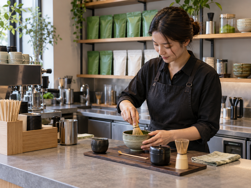
Matcha can leave visible green marks, while water, milk, and ice create ordinary café spills. Select work surfaces for cleanability, durability, and suitability under local requirements before choosing a visual theme. Test a material sample with the cleaning procedure the staff will use. On the guest side, lighting should make the menu legible and drinks appealing without blinding staff at the counter. Natural light can be pleasant but may affect display and product storage if direct sun reaches stock.
Color can cue the brand without turning every surface green. A restrained backdrop may show the drink more clearly. Take test photos at morning and evening light if social sharing matters, but do not let photography drive station placement. Materials have a maintenance cost: a delicate finish that looks good on opening day may quickly appear worn at a busy pickup point. Ask who cleans it, with what, and how often before approving the specification.
| Surface or light | Practical check | Common issue |
|---|---|---|
| Work counter | Clean after matcha and milk | Staining or seams |
| Menu lighting | Read from queue position | Glare or low contrast |
| Display light | Show real product color | Heat or direct sun |
9. How do you test the layout before opening?
Rehearse a busy service window
Make a scaled floor plan and a list of actual equipment dimensions. Then mark footprints with tape or temporary objects in the space. Have staff simulate several orders in sequence: a hot latte, iced matcha, retail question, and pickup at the same time. Time the routes and note where hands, bodies, or carts collide. Include restocking and cleaning. A plan that handles one drink elegantly may fail when two people work side by side.
Document each friction point and decide whether it requires a layout change, a process change, or training. A queue that blocks the entrance is a layout problem; a barista walking to a distant syrup bottle may be a storage problem. Repeat the rehearsal after changes. Qualified designers and contractors should confirm site-specific code and technical requirements, but the operator still owns the service test. The people who will work there often spot problems a rendering cannot show.
10. What should be revised after launch?
Watch the room at its busiest
Observe actual queue length, pickup confusion, drink times, and which seats guests choose. Ask staff where they reach, turn, wait, and remake. Change movable items first: signage, a display stand, cup storage, or pickup position may solve a problem without construction. Record before-and-after observations so a change is judged by service rather than taste alone. The first week may be unusual; check again once regular customer patterns emerge.
Keep a short punch list with an owner and priority. Some issues are cosmetic, while others affect food handling, accessibility, or safety and should go to the responsible professional promptly. Review menu performance with the layout: a new cold foam item may need extra chilled storage, and a flight may occupy more counter and table space. Design is a continuing operational choice. Preserve the calm experience by making the room easier for staff and guests to use.
| Observation | Likely first move | Measure afterward |
|---|---|---|
| Pickup crowding | Move sign or shelf | Fewer handoff delays |
| Long restock walk | Reassign storage | Less bar interruption |
| Unused seating | Adjust table mix | Seat use by time of day |
FAQ
Q1. Does a matcha café need a visible whisking counter? Only if it fits the service model. Test whether visibility adds value without slowing preparation or compromising handling.
Q2. Should the whole café be green? Color is a brand choice. Legibility, cleanable surfaces, useful lighting, and a workable route matter more than a literal color scheme.
Q3. Where should retail matcha packs go? Place them where guests can see them without blocking the order line, and keep sale stock within its storage guidance.
Q4. How much seating is enough? Start with expected guest dwell and floor area, then test circulation and local requirements with a qualified designer. There is no universal seat count.
Q5. What is the cheapest useful pre-opening test? Tape out the bar and guest path, then run a short mock rush with the equipment and cups planned for service.
Design the room around the real order
A good matcha café feels coherent because the menu, station, queue, and seating support each other. Set the service brief, walk the guest route, rehearse the bar, and revise from observed use. Materials and color can then reinforce a room that already works.