
Matcha packaging design must help a customer recognize the product while preserving room for accurate food information and a pack that protects the powder. A beautiful mock-up can fail at the sealing line or leave no space for a readable lot code. Start with the SKU, market and material brief, then build and test a filled production proof. Our matcha labeling guide covers the label review that should run alongside creative development.
Contents
- 1. What should the design brief define?
- 2. Which format fits the sales channel?
- 3. How do barrier needs shape the artwork?
- 4. What information needs reserved space?
- 5. How should product identity appear on the front?
- 6. Which origin and organic claims need review?
- 7. Where should barcodes and lot codes go?
- 8. How should multilingual versions be controlled?
- 9. What should a printed proof test?
- 10. How does artwork reach the packing line safely?
1. What should the design brief define?
Begin with a real SKU and buyer route
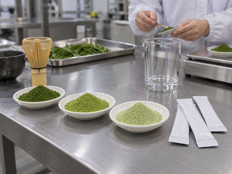
State whether the product is pure matcha, a latte mix or another blend. Name the destination, retail or foodservice channel, pack size, expected display and the customer who will open it. A design team cannot choose useful panel space from a logo and a mood board alone. Ask product development for the ingredient statement and quality for the approved product code. Purchasing should add target cost and the actual packing route.
Separate fixed requirements from preferences. The company mark and product name may be fixed; a particular green shade may be a brand preference. A barrier structure, seal area and required label information constrain what artwork can cover. Put the package supplier and packer into the project early. They can tell the designer which surfaces fold, seal or receive a lot stamp. A mock-up approved without those details often needs costly redesign just before printing.
2. Which format fits the sales channel?
Judge use before shelf appearance
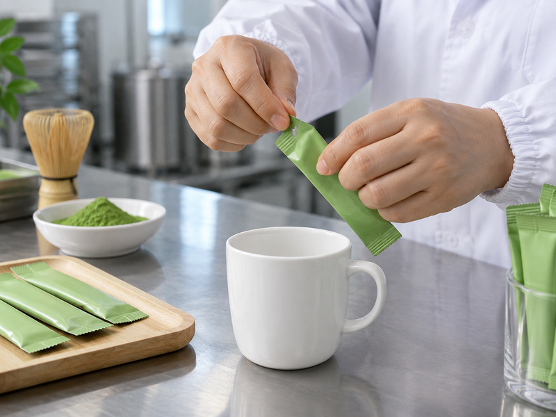
Tins, pouches, sachets and bulk bags each create different graphic opportunities and handling needs. A small retail tin may carry a strong shelf silhouette but require an inner contact layer and a careful opening design. Flexible pouches can use a broad front panel yet place artwork near a heat seal or fold. Foodservice staff may value a legible product code and easy closure more than a large decorative story. Ask the intended user to open and dispense from a physical sample.
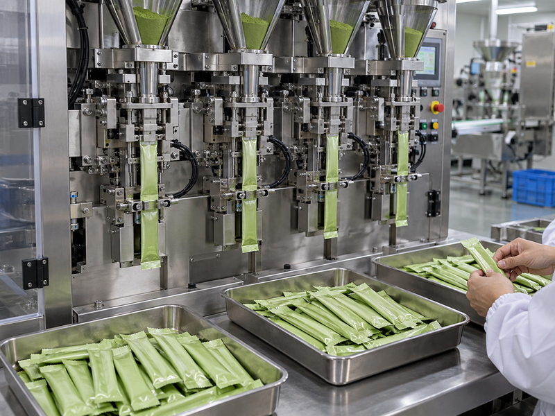
Choose a format through a short matrix: product protection, unit cost, fill-line fit, shelf presentation, shipping damage and after-opening use. Do not compare empty containers alone. The powder’s bulk density and the packer’s equipment can affect dimensions and fill level. Request a filled pilot before final artwork. If a format fails the handling test, adjust the package before spending time perfecting its printed illustration.
| Channel | Format question | Design consequence |
|---|---|---|
| Retail shelf | Visible identity at distance? | Front-panel hierarchy |
| E-commerce | Survives parcel route? | Carton and pack strength |
| Foodservice | Fast to identify and use? | Code and closure priority |
3. How do barrier needs shape the artwork?
Design on the approved material
Matcha powder packaging should limit the exposures identified in the shelf-life and distribution plan, including moisture, light and oxygen where relevant. A clear window or a thin paper look may serve a visual idea but requires validation against product protection. Ask the pack supplier for the proposed material construction and the packer for its seal margins and print restrictions. A metallic-looking film is not proof of a particular barrier value; request test data with conditions.
Create artwork only after the technical pack has a controlled code. If the brand changes from opaque to transparent material, repeat the relevant stability and food-contact review. A print change can also affect seals if ink, varnish or lamination moves into the wrong area. Ask a packaging specialist to mark no-print and seal zones on the dieline. The artwork should reinforce the product promise without forcing an untested material choice. A physical proof under normal store lighting will reveal more than a bright screen mock-up.
4. What information needs reserved space?
Let market review set the content list
Reserve panels for the food name, ingredient information, net quantity, business details, storage instructions and any other required content for the destination. The exact list and format vary by market and product. The European Commission lists mandatory particulars for prepacked foods, while FDA provides a U.S. food-labeling guide. A qualified reviewer should translate those sources into the final SKU’s artwork requirements.
Put a content owner beside each line. Product development confirms composition; quality or regulatory reviews required statements and claims; the brand controls tone and layout. Leave space for lot and date coding as production information, not a graphic afterthought. Test readability on the actual curved tin or flexible pouch. A label that looks clear at 200 percent on a screen may be hard to read when printed at retail size or stretched over a fold.
| Content | Owner | Design need |
|---|---|---|
| Product name | Brand and regulatory | Front-panel clarity |
| Ingredients | Product and regulatory | Readable text area |
| Lot and date | Packer and quality | Clean coding zone |
5. How should product identity appear on the front?
Tell the buyer what is in the pack
Make it easy to distinguish pure matcha from a sweetened latte powder, a hojicha product or a matcha blend. Similar colors and shared brand graphics can help a product family look coherent, but they should not conceal meaningful ingredient differences. Use the front panel to show the product name and format plainly. If the pack suggests “ceremonial” or another grade, confirm what the supplier means for that exact SKU and whether the brand can support the wording.
Test the pack with people who did not attend the design meeting. Ask them what they think it contains, how they would prepare it and which flavor or origin they infer. Record mistaken assumptions. A scenic photograph may imply a growing region even when the powder comes from another place. A cup image may imply a ready-to-drink product when the tin holds dry powder. Adjust the artwork before printing rather than assuming a back-panel correction will solve a misleading first impression.
6. Which origin and organic claims need review?
Build the evidence before the visual badge
Ask the supplier which product, lot and operator support an origin or organic claim. A factory address does not prove where the leaf grew. Organic status requires current certification scope and, for imports, the applicable transaction route. The USDA explains organic labeling categories and certifier review. Do not place a seal or broad “organic” claim on a U.S. pack because another product in the supplier’s catalogue is certified.
Have the qualified market team approve every claim before it becomes a graphic asset. This includes “shade grown,” named region, cultivar and health or nutrition statements. Keep the approved wording with the specification and evidence. If the source or formula changes, reopen the review even if marketing wants the same front panel. A well-designed pack should communicate true attributes clearly, not make a certificate or farm story look more extensive than the actual SKU supports.
| Claim type | Evidence route | Artwork decision |
|---|---|---|
| Origin | Input-to-finished trace | Precise place wording |
| Organic | Scope and market review | Seal or text approval |
| Grade | Product definition and sample | Avoid ambiguous promise |
7. Where should barcodes and lot codes go?
Test coding on a filled pack
Barcodes, date marks and lot codes need flat, readable areas that survive printing, sealing and handling. Ask the packer how it applies codes and which panel position works on its line. A beautiful dark illustration can make a printed lot unreadable; a crease can distort a barcode. Reserve a clean coding zone on the dieline and test the result with the buyer’s warehouse scanner. Human-readable text still matters when a device fails.
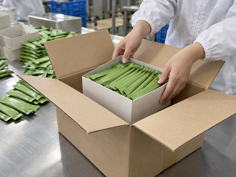
Keep the code format in the pack specification and connect it with production and shipping records. A pallet may contain several lots or artwork revisions, so carton labels should identify contents without opening every unit. Ask the fulfillment team to receive a pilot carton and report how quickly it can reconcile the product and lot. If the code rubs off or is hidden by a retail sleeve, revise placement before full launch. Traceability deserves design space, not a last-minute sticker.
8. How should multilingual versions be controlled?
Treat each market file as a distinct revision
One global graphic template can support several markets, but the text may need different language, units, business details and approved claims. The European Commission explains that mandatory information must be understandable to consumers in the Member State of sale. Ask qualified market reviewers to approve each version. A supplier should not translate final label text from memory or copy a previous market’s regulatory panel.
Give every artwork version a clear file name, product code, market and approval date. Keep the source text, translated text and proof together. At packing, staff should stage only the version named on the purchase order. A label error can occur even when the powder and pack material are correct. Ask how obsolete rolls or tins are removed and accounted for. If a late change affects only one market, do not silently alter shared content for the others. Version control is part of the brand system.
| Version field | Why it matters | Check at packing |
|---|---|---|
| Market | Different text requirements | Correct destination |
| Language | Readable information | Approved translation |
| Revision | Prevent old artwork | Line clearance |
9. What should a printed proof test?
Inspect more than color accuracy
Request a proof on the intended material, at actual size, with the correct finishing process. Check text size, contrast, images, fold lines, seals and coding zones. Put the proof around a real filled unit where possible. A curved tin can alter the apparent spacing of a label, while a flexible pouch may crease across a carefully placed headline. Ask production staff whether marks needed for registration, cutting or sealing are accounted for.
Have quality review the ingredient and claim text on the proof, not only on the design file. Scan the barcode and apply a sample date or lot code. Ship a few finished units through a pilot route to assess scratches, scuffs and readability after handling. Keep a signed proof or a controlled digital record. If the printer changes material, ink or varnish after approval, ask whether a new proof and food-contact review are needed. The proof is the bridge between design intent and the pack customers will hold.
10. How does artwork reach the packing line safely?
Close the approval loop before printing
Create one handoff sheet listing SKU, pack code, artwork revision, market, print quantity, lot-code area and named approvers. The designer supplies the final file; the brand and qualified reviewer approve content; the printer confirms technical feasibility; the packer checks the received components against the order. Ask who can authorize a correction after approval and how the old file is withdrawn. A late email with an attachment should not become the line’s only instruction.
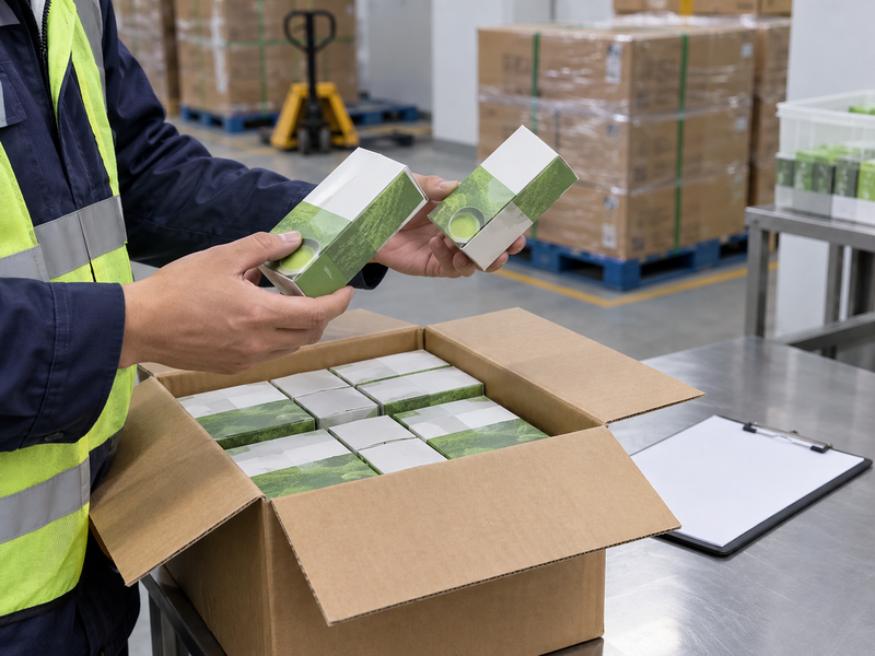
Run a short pilot and inspect units from normal production. Confirm powder identity, printed text, seal, net weight, lot readability and carton label. Record any change needed before the next print run. Matcha Village’s supplied materials describe retail formats and private-label support, but each brand still needs a controlled pack and claims file for its chosen product. Effective matcha packaging design helps a buyer recognize the product and helps the producer make that same pack again.
| Handoff step | Required output | Sign-off |
|---|---|---|
| Content | Approved wording | Brand and qualified reviewer |
| Material proof | Printer and packaging team | |
| Packing | Correct SKU and artwork | Line and quality |
FAQ
Q1. Should artwork start before pack material is chosen? Early concepts can, but final files need the approved dieline, material and seal zones.
Q2. Can a supplier approve my label claims? The supplier can provide evidence; the brand should arrange qualified destination-market review.
Q3. Is a screen mock-up enough for launch? No. Inspect a printed proof and filled unit at actual size.
Q4. Can one artwork file serve every country? Only after each market’s text, language and claim requirements are reviewed and versioned.
Q5. What should the purchase order reference? Include product code, pack code, artwork revision, destination and approval record.
Start the design project with the product and market brief. Build the artwork around an approved protective pack and a reviewed content list, then test a printed, filled pilot. That process gives customers a clear product and gives your packing partner a file it can reproduce without guessing.