
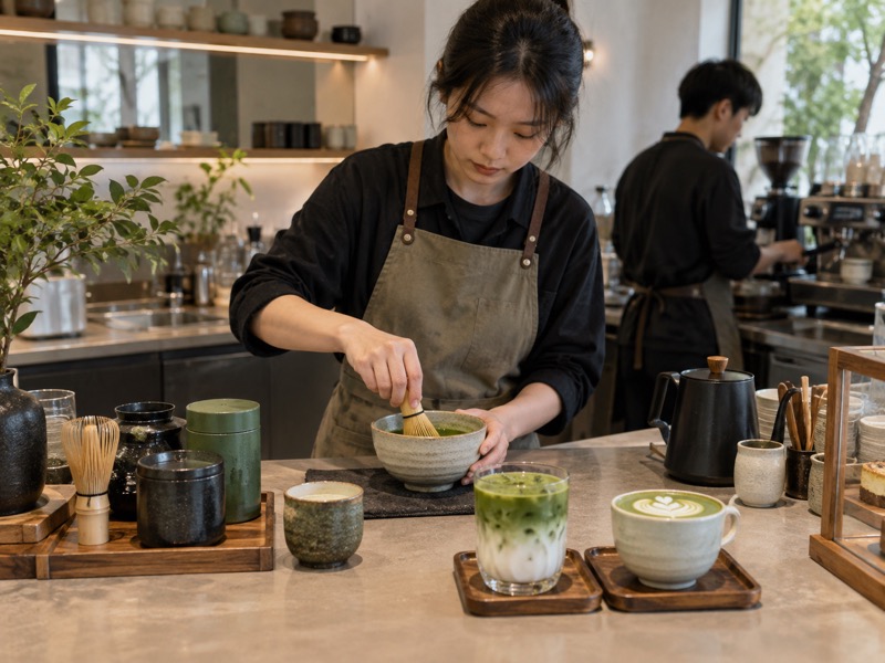
The matcha aesthetic is the visual language built around the tea’s green color, preparation tools, texture and serving rituals. It can help a café or brand become recognizable, but an attractive photograph does not fix a weak or inconsistent drink. A vivid green edited into an image can set an expectation the product cannot meet. Ujicha Matcha’s discussion of the matcha aesthetic reflects a consumer view of the look. A business needs to build that look from its real ingredients, cups, packaging and service, then check that ordinary customers see the same thing.
For: café operators, tea brands, packaging teams and ingredient buyers. Decision: whether the visual identity makes the product clearer and more credible while remaining achievable in daily service.
1. What is the visual promise of the product?
Start with the actual cup
Describe the product before choosing props: its green shade under normal light, surface texture, cup size, layers and garnish. Then decide what the imagery should help customers understand. A tea-forward whisked bowl calls for different visual cues from a sweet iced fruit latte. If every item uses the same pastel background and green swirl, the menu may look coherent but tell the guest little about what each drink tastes like. Make a simple photograph of the actual serving as the reference point.
Choose a small set of cues. Ceramic texture, a visible whisking step, transparent glass or a clean pack can each serve a purpose. Do not add all of them by default. Ask whether the cue helps a buyer recognize the product, its size or its use. The strongest visual system is one staff can reproduce without a stylist standing at the bar. If the image promises a thick foam cap, the shop’s recipe and equipment need to deliver it consistently.
| Visual cue | Useful message | Reality check |
|---|---|---|
| Green tea surface | Tea is central | Match actual product color |
| Preparation tool | Method is visible | Tool is really used |
| Cup and portion | Guest knows serving | Use normal size |
2. How should green color be represented?
Fix the lighting, then compare
Matcha color varies by tea lot, milk, process, serving temperature and light. Photograph a reference serving in the shop’s normal light and in a controlled light setting for product images. Keep editing restrained. If the powder is sold as a raw ingredient, show it and a prepared use in separate images; dry green is not a promise that every latte will match it. Ask the product team to approve the image against a physical reference cup or pack.
Set a practical tolerance. Some variation is normal. A customer should still be able to recognize the product from the image. When a tea lot changes, compare it with the approved reference sample and decide whether the recipe or image needs review. Color can suggest freshness or quality, but it does not prove origin, grade or safety. Avoid captions that turn a visual cue into a claim the company cannot document.
3. Which preparation details should be shown?
Photograph what the team does
A whisk, bowl, scale, sieve or milk pitcher can tell the story of a drink. Show tools that are part of the actual preparation, and keep the sequence believable. A stock photo of a ceremonial bowl beside a ready-to-drink can may look appealing but confuse the production method. For a wholesale ingredient, a clean sample room or measured formulation trial may be more relevant than a staged home ritual. The image should answer a practical question about how the product is prepared or used.
Keep people natural. Hands and faces in working scenes should look like staff at the actual venue. Avoid implying a location, workforce or process that does not belong to the business. A realistic image can still be attractive: accurate equipment, good light and a clear subject do most of the work. If AI-generated imagery is used, review it for impossible tools, invented labels and misleading manufacturing scenes before publication.
| Scene | Good use | Avoid |
|---|---|---|
| Café pour | Show standard drink assembly | Unreal foam or cup size |
| Ingredient sample | Show powder and use | Fake test numbers |
| Factory scene | Show actual type of work | Unsupported facility claims |
4. How should packaging carry the aesthetic?
Protect the powder first
Packaging has a functional job: protect the tea through shipping, storage and use. Color, texture and typography can support the brand, but a beautiful tin is not enough if its seal or pack size does not fit the buyer’s use rate. Test the actual format with the tea and distribution route. A café using a large bag quickly has different needs from a consumer opening a small tin over several weeks. Keep lot codes, ingredient statements and required information legible even when the design is restrained.
Design for recognition. Let customers distinguish pure matcha from a sweetened latte mix and separate different sizes or grades without reading tiny copy. A consistent green palette can help, but it should not hide material differences. If a package includes a photograph of a finished latte, the recipe behind the image should be achievable with the product. Packaging can suggest an experience; it should not imply an ingredient or origin that the pack does not contain.
5. What should a menu photo show?
Use the normal serving route
Make the drink with trained staff, the intended ingredients and the selling cup. Photograph it at handoff and after the usual wait. Include a second view if the cup’s layers or toppings may confuse size or content. A camera angle that makes a small cup look large can create disappointment. Strong editing can turn a dull green into an impossible neon shade. The menu photo should be an accurate ordering aid, not an independent piece of art.
Test customer interpretation. Show the image without the drink name and ask a few people what they expect to taste and receive. If they assume a strawberry drink because of pink foam but the drink contains no strawberry, the image may need a clearer caption or a different garnish. Do the same for dairy and plant-based versions if their appearances differ. An honest image can still be striking when it makes the product easy to understand.
| Image decision | Guest question | Check |
|---|---|---|
| Cup crop | How much will I get? | Show normal portion |
| Garnish | What flavor is present? | Match ingredient list |
| Edited color | Will mine look like this? | Compare real cup |
6. How can a café repeat the look at scale?
Turn appearance into a recipe outcome
Specify powder dose, milk or water amount, mixing method, cup, ice, topping and handoff time. These steps determine color and texture. A service photo cannot be replicated if the recipe is vague. Train several staff and compare consecutive drinks, not just the best one. Keep a fixed-light reference image at the bar. Where some variation is allowed, explain which part of the look matters most: tea color, fill level, foam, or a clean rim.
Measure the tradeoff. An elaborate pattern or layered pour may slow a rush. Time the assembly and count remakes. If the aesthetic depends on a garnish that wilts or falls off, change the service standard. A simple, stable cup can be more valuable than a complex image that only one barista can produce. The visual goal should support the operation, not compete with it.
7. What claims must the imagery avoid?
Separate atmosphere from evidence
Visual language can imply origin, process and quality even without words. Japanese architecture, a tea farm, or a laboratory may suggest facts about a product. Use those cues only when they are accurate and relevant. If a brand sells Chinese-produced matcha, a Japanese farm image should not be used to imply that its own powder came from Japan. If a photo shows a testing lab, do not add fictional result numbers or imply a certification that was not obtained.
Review the whole page. Packaging, alt text, captions and surrounding copy can all turn an image into a claim. Ask the team responsible for labels and sourcing to review origin and certification statements before publication. A clear description of what the product tastes like and how it is used is often more persuasive than an unsupported prestige cue. Trust comes from the actual product matching the picture.
8. How should visual assets be planned for each channel?
Make the image fit the decision
A café menu needs to show serving size and flavor cues. An ingredient buyer may need powder, pack format, application examples and a specification sheet. An online store may need the front and back of the pack plus a prepared serving. One hero image cannot answer every question. Plan a small set of photographs that follows the buyer’s decision: identify, compare, understand use and verify details. Keep aspect ratios and safe margins in mind so the product and its useful details are not cropped on different screens.
Maintain a source file. Record product version, date, tea lot if relevant, recipe and photographer or generation method for each asset. When a pack or formula changes, the image can be reviewed quickly. Do not leave an obsolete nutrition panel or old ingredient claim in the gallery. Visual consistency is easier when the team knows what each asset represents.
| Channel | Main buyer need | Image priority |
|---|---|---|
| Café menu | Know the drink | Real portion |
| Wholesale sheet | Evaluate ingredient | Pack and application |
| Online store | Verify product | Pack details and use |
9. What does the visual approach cost?
Count production and service work
Photography, styling, retouching, packaging design and menu revisions have costs. So do the props and procedures needed to make every sold cup match the photo. A garnish that appears in every image should be included in the recipe and costed per serving. A branded tin may improve shelf presence but raise packaging cost and shipping weight. Compare these choices against the product’s margin and customer need. Do not treat social-media performance as a substitute for profit or repeat orders.
Reuse assets carefully. A close-up of a plain matcha latte should not be reused for a flavored mix with different ingredients. Keep a small, accurate library rather than a large set of pretty but ambiguous images. If an AI-generated image is used, review it like any other asset and disclose or label it where the relevant rules or brand policy require. The final commercial decision is whether the visual helps sell the real product responsibly.
10. What should a brand test before publishing?
Put images beside the product
Set the actual cup, pack or powder sample next to proposed visuals. Ask staff and a small group of target customers whether they expect the same color, portion and ingredients. Make the drink under ordinary service conditions and photograph it with no special styling. Check claims and alt text against product records. Test mobile crops to confirm that the cup, label and key details remain visible. If the image is compelling but misleading, revise it before publishing.
Keep a change rule. New tea lots, formula changes, cups, packs and suppliers can alter the product’s appearance. Decide who reviews the asset when one of these changes occurs. The next action is a short visual audit of the current product gallery against real samples. A matcha aesthetic works when the look is distinctive, useful and honest enough to survive daily service.
| Review point | Pass question | Evidence |
|---|---|---|
| Product match | Does image resemble real item? | Side-by-side check |
| Claim accuracy | Is origin or process implied? | Source review |
| Service | Can staff repeat the look? | Shift trial |
| Crop | Is the subject visible on mobile? | Screen preview |
A visual brand standard should also use the matcha color guide to check the real product.
Reference: The Matcha Aesthetic: Why It’s Everywhere on Social Media is a consumer trend reference. The brand and service checks above are independent.
FAQ
Q1: Does a matcha aesthetic require a very bright green? No. The image should match the actual tea and prepared product under reasonable light.
Q2: Can an AI-generated photo be used? It can be reviewed as a visual asset, but it should not invent ingredients, equipment, people, claims or product performance.
Q3: What should a café photograph first? The standard serving made by ordinary trained staff in the selling cup.
Q4: Can one image serve every channel? Different buyers need different details; a menu and a wholesale sheet usually need different views.
Q5: What should trigger a new image review? A change in formula, tea lot, cup, pack, ingredient claim or service method.